Language and Interfaces
Aug 24, 2026
Open a Chinese app next to its Western equivalent and you feel something before you can name it. More things on screen. Smaller gaps. Every button wearing a text label.
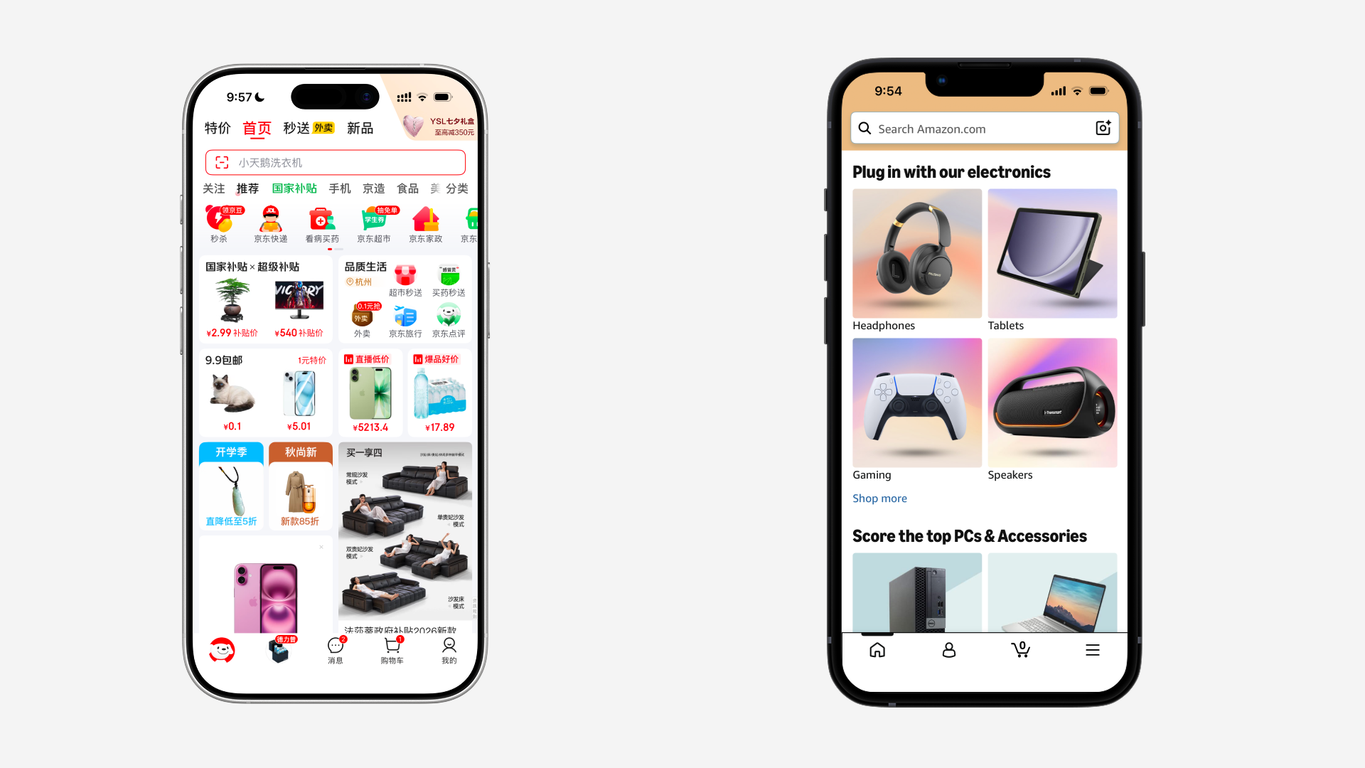
The usual explanation is historical. China went from desktop straight to mobile and skipped the years where Western products learned restraint. It is a tidy story, and it is not a mechanism. It tells you when something happened, not why the pixels ended up where they did.
But when we look at Apple, who ships around forty locales out of one design system. Open Settings on an iPhone in English, then in Simplified Chinese, then German, then Arabic. Same rows, same order, same heights, same margins. In Arabic the entire screen mirrors, and it is still recognizably the same screen. Their marketing site does the same thing: apple.com.cn is apple.com with different strings poured into it.
If language dictated layout, that would be impossible. So the honest claim is narrower than the title, and it turns out to be far more useful that way. Language's effect on interfaces is real, measurable, and local. It lives inside components. Almost everything above the component that looks like language is history and business model wearing language's clothes.
Where a Chinese app is crowded and its own English build is just as crowded, that is culture, and we should say so plainly instead of blaming the writing system.
The rest of this essay is the real differentior. Five properties of a writing system that propagate into layout whether you plan for them or not.
Atom size
Every writing system has a smallest indivisible unit. In English it is the word: variable length, occasionally enormous. In Chinese it is one character: fixed, and small.
Almost everything else follows from that.
The clean way to see it is min-content, the narrowest a box can be before its contents start spilling out of it. Drag the handle.
English stops. It cannot go narrower than "Internationalization", because a word is an atom and there is nowhere inside it to break. Chinese keeps going until it is one character wide.
Stated as a layout rule, that stops being trivia. English text imposes a minimum width on its container. Chinese text does not. An English column has a floor set by its longest word. A Chinese column has no floor worth designing around.
That is the real reason responsive layout is harder in English, and it has nothing to do with density.
The second-order effect is quieter and probably more expensive. Chinese advance widths are uniform, so a string's width is a linear function of its character count. A Chinese designer can write "no more than six characters" into a spec and know the pixel width at design time. An English designer cannot know a width without measuring it at runtime.
Which is why English design systems are full of min-width, max-width, truncation policy, and container queries. Half your design system is a workaround for a writing system, and it never admits it. That machinery is not general good practice. It is compensation for an unpredictable atom, and it reads as maturity only because everyone who might have noticed grew up inside it.
Density, and what it actually buys
Here the received wisdom is half right.
Chinese is denser per character. But there is a finding worth knowing before you go spending that. Coupé and colleagues measured seventeen languages in 2019 and found them all landing near the same information rate, around 39 bits per second. Dense syllables get produced slower, sparse ones faster, and languages self-balance.
Applied to a screen, that guts the naive version of the argument. Chinese is not delivering more meaning per glance. It is delivering the same meaning in less area. Density is a spatial discount, not an informational one.
And the discount is charged back somewhere. Latin's distinguishing features are gross outline shapes, resolvable small. Chinese's are interior strokes at high spatial frequency: 未 and 末 differ only in which horizontal stroke is longer. So Chinese carries a legibility floor that Latin does not.
Now spend the discount and see what survives paying the floor.
Two results, and they point opposite ways.
In chrome, Chinese wins outright and keeps winning even after the legibility bump. Five labelled tabs is a Chinese luxury; English cannot fit "Notifications" into a fifth of a phone width and has to truncate it, abbreviate it, or drop to an icon.
In body text, the win mostly evaporates. Set Chinese at a size where it is actually readable, with the line-height it actually needs, and the area advantage shrinks toward nothing.
So the density advantage is real in chrome and close to nothing in running text. Which is exactly where you feel it: tab bars, toolbars, table headers, buttons, filter chips. Not articles. If a Chinese page feels crowded in its prose, density is not what did it.
The generalizable part has nothing to do with Chinese at all. English is redundant, so it survives damage: truncate it, shrink it, render it badly, misspell it, and it still reads. Chinese is compressed, so it is brittle. Compression and error tolerance are the same dial. An icon is a maximally compressed label and therefore maximally ambiguous. A gesture is denser than an icon and therefore invisible. A keyboard shortcut is denser than a menu and therefore unlearnable without a menu to teach it. Chinese and English are just the cleanest place to watch the dial move, because you can hold the meaning constant and vary only the compression.
Hierarchy channels
Latin encodes rank inside the letterforms themselves. Case gives you three levels at no cost. Then italic, then weight, then small caps, then letterspacing. Five channels for signalling importance without touching size or color.
Chinese has weight, and weight is the weakest of the five here: bolding a dense glyph fills in its counters instead of adding contrast against surrounding whitespace. There is no case at all. Synthetic italic is the one channel that actively makes CJK worse.
Hierarchy has to come from somewhere.
The middle pane uses exactly the channels the left pane uses, and they collapse into one gray block. The right pane gets the hierarchy back by spending a different budget: size jumps, three colors, a filled chip, a rule.
This is the part of "Chinese interfaces look busy" that is honestly about language. The color and the boxes are not a taste failure. They are what you have to buy when the typographic channels are not for sale.
Direction is a change of basis
Right-to-left is not a translation problem. It is a change of coordinate system, and it sorts a design into two piles: the parts that encode meaning in relationships, and the parts that encode it in positions.
Some things mirror. Reading order, alignment, back arrows, progress, sliders. Some must not. Clocks, media transport, icons of physical objects that exist in one handedness. And numbers do not mirror at all: Arabic numerals stay left-to-right inside a right-to-left run, which is why one line can carry two directions, and why the visual order of a string stops matching its logical order. Cursor movement, selection, and string indexing all quietly stop meaning what you assumed they meant.
A design that survives mirroring is one whose meaning lives in relationships. That is a testable property, and it costs nothing to check.
The tools are not neutral
CSS has a length unit called ic. It is defined as the advance width of the character 水.
It exists because em, ex and ch are all defined against Latin letterforms — the em quad, the x-height, the advance of a zero — and none of them can express "one Chinese character wide." Somebody had to add a unit to the web platform, in this decade, so that a Chinese layout could be described at all.
Keep pulling and it does not stop. CSS inline layout is a formalization of the Latin line: baseline, ascender, descender, leading, none of which exist in a writing system set on a square em body. text-spacing-trim and text-autospace are recent specs that exist to handle CJK punctuation and the CJK-to-Latin gap. writing-mode: vertical-rl is a retrofit. Full-width and half-width forms in Unicode are a fossil of two typesetting technologies colliding.
The CSS changelog is a public record of a Latin machine slowly being taught about another writing system, and it is not finished.
This generalizes past typography, which is the uncomfortable part. Sort order, string length, tokenization for search, truncation, capitalization APIs. toUpperCase() is a function that assumes case exists. Every abstraction leaks the language it was designed for, and the leak lands on somebody else.
The one that is not typography
There is a sixth property, and it is not about shapes at all.
You cannot type a Chinese character directly. Every text field is a type, then look at candidates, then select. On every device, since the eighties. Which means production cost has always been high relative to recognition cost, which means selection has always beaten typing, which means visible affordances have always beaten memorized ones.
Mnemonic shortcuts cannot exist when 保存 contains no S. So the toolbar carries the load the shortcut carries in English, and it has carried it for forty years.
That is a better answer than "China skipped Web 2.0," because it is a mechanism rather than a date. Chinese desktop software already had mobile's input economics before mobile existed. It converged on mobile's interface grammar early, and the phone was continuity rather than rupture.
It also generalizes off the specific case. The ratio of recognition cost to production cost governs interface shape everywhere. It is why mobile interfaces are selection-heavy in every language, why voice interfaces are menu-shaped, why accessible interfaces favor picking over typing. Language is one input to that ratio. Chinese only makes it visible because the ratio is extreme.
Who yields
Which brings us back to Apple, and to what they actually did, which is not diligence.
When a string changes length, something in the layout has to give. There are only four answers:
- The text truncates. The container wins.
- The container grows. The text wins.
- The text shrinks. Split the difference.
- The layout changes arrangement. A row becomes a stack.
Language tolerance is decided entirely by which one you picked, per component, in advance.
margin-inline-start and text-align: start rather than left and right. Only the fourth card is still intact in every locale, and it is the only one that changes arrangement instead of changing the text.Only the fourth card is still intact in every locale, and it is the only one that changes its arrangement instead of changing its text.
Apple survives forty locales because they made that choice explicitly, everywhere, and mostly chose the fourth. Dynamic Type forced it years before localization did: once a user can set body text to 53pt, every layout in the system already has to know how to rearrange itself, and a layout that can rearrange for an accessibility size can rearrange for German.
The mirroring is the same story told with different words. UIKit gives you leading and trailing, not left and right. Auto Layout gives you relationships, not coordinates. Intrinsic content size means a component derives its size from its text instead of asserting a size over it. Their layout vocabulary makes brittleness harder to express than flexibility. CSS handed everyone left, so everyone used left, and margin-inline-start is the platform catching up a decade later.
Most teams never make the choice at all. So they get option one by default, and truncation is the failure a user reads as "this product was not built for me."
What is left over is culture
Run all six properties against a genuinely crowded Chinese app and they account for less than you would like.
Atom size and predictable extent are real, and they buy you a slightly tighter row. Density in chrome is real, and it buys you a fifth tab. The missing hierarchy channels are real, and they explain the color and the boxes. Input economics are real, and they explain the visible toolbar.
Everything else is not the writing system. The four entry points to the same feature, the banner above the banner, the storefront inside the messaging app, the red dot on a tab that has nothing new in it. That is a super-app business model, a brutal acquisition-cost market, an ad load, and a growth team with a quarterly number. The proof is that the same companies' English builds are usually just as crowded.
Language shapes interfaces. It just does not shape them at the altitude where people keep blaming it.
One more test
Wording in Interfaces ends with seven rules. It seems only fair to run them through the same procedure.
 Wording in Interfaces
"Verb only what has no noun" dies immediately. 设置 is both the noun and the verb, and Chinese does not mark the difference morphologically, so the rule was describing English grammar rather than interface design.
"Text has a shape" transforms rather than dies. Chinese text is a rectangle by default, so every widow, orphan and hyphenation problem I solved there was a Latin problem in disguise. The rule survives; all of its examples were parochial.
"Every string must add information", "never leave a dead end", "consequences, not fear", and "one concept, one word" come through intact. They were never about English.
What survives translation was a design principle. What dies was English wearing one.
That is the entire method, and it is cheap enough to run this afternoon. Take an interface you are proud of and set it in a language you did not design it for. What breaks tells you what you actually built, and what you only inherited.
Notes
- Coupé, Oh, Dediu & Pellegrino, Different languages, similar encoding efficiency, Science Advances, 2019. The 39 bits per second result.
- The
icunit, and the rest of CSS's font-relative lengths: MDN - Apple's Right to Left guidance is the shortest good description of what does and does not mirror.
- If you want more of this kind of thing, I collect interface details at Detail.