As an indie hacker, you don't need to use Figma like a large organization. Typically, if you're an indie hacker, you may:
- Have several websites for landing or documentation, or an all-in-one like YGeeker created by me
- Have several apps. Some on iOS only, some on multiple platforms, some extensions, etc.
- Work solo most of the time. But sometimes your fans or enthusiasts help you with an icon, a page, etc.
If you're an indie like me, in this post, I'll share how I manage my team, files, and pages in Figma. This is tailored for solo makers and will boost your work efficiency.
Pages
Your assets in Figma look like this:
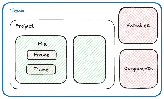
Typically we put each screen in a Frame.
It’s not recommended to put all frames in one page. Instead, use new page for a new screen. The space in the editor allows you try different ideas. Good design needs tries, tries, and retries. Besides, if a page is for a component (such as buttons), you may need to create variants for that, so it’s always a good idea to leave more space. Trust me, you won’t like navigating by dragging your pointer and finding the frame in a mess.
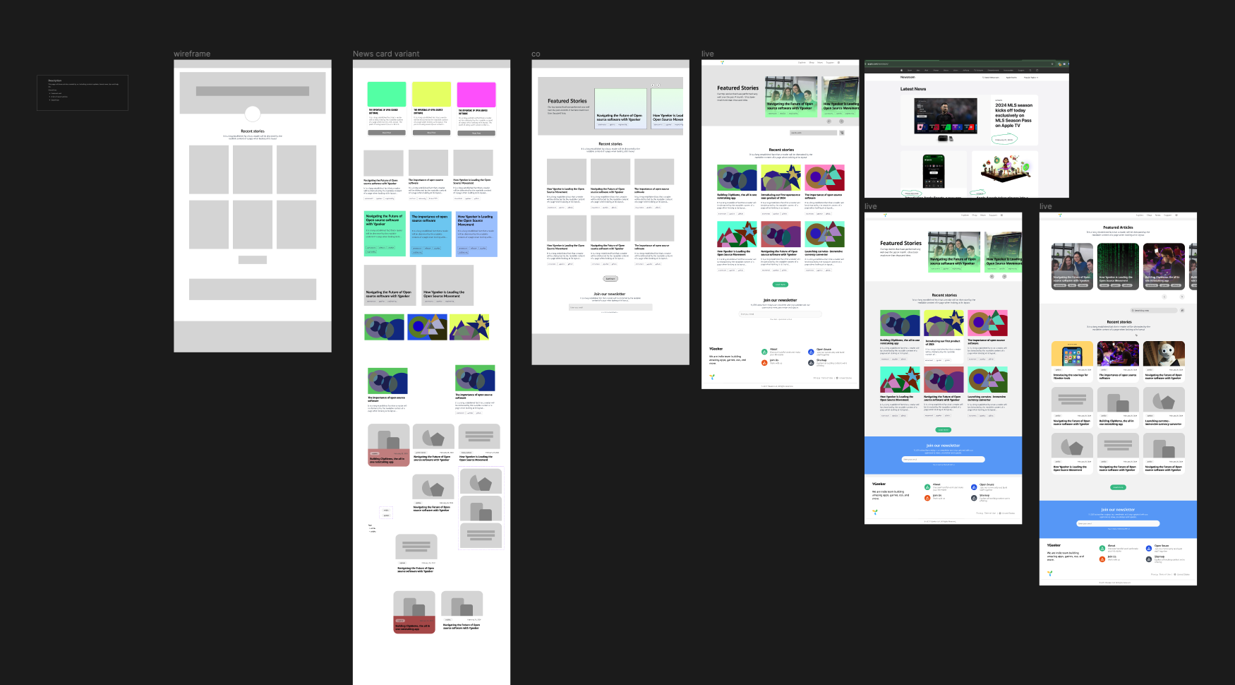
Here’s the Newsroom page (a single page in Figma) created by my colleague for the Newsroom page of YGeeker. A perfect example:
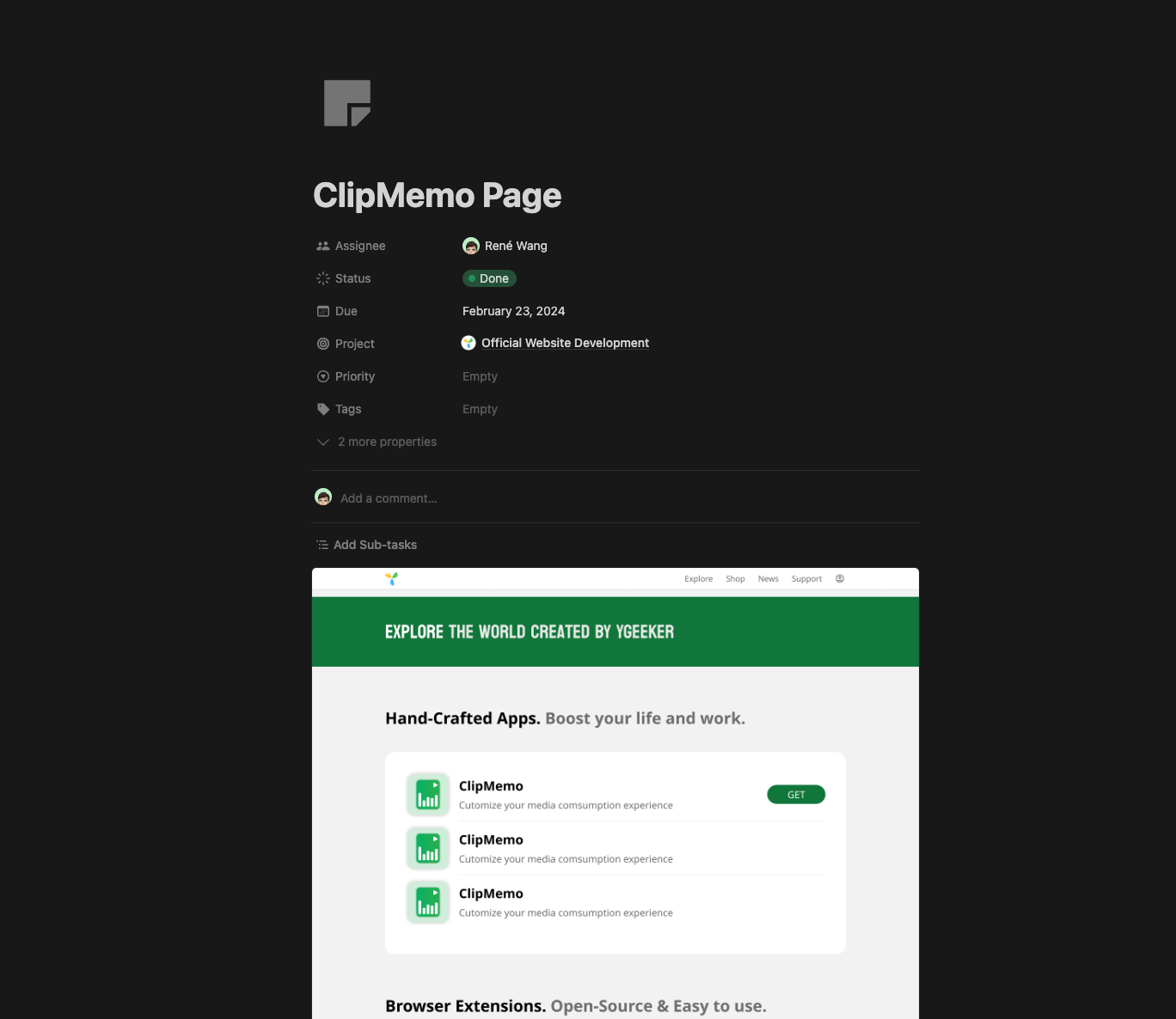
A golden test is use Notion’s Figma block. If you can clearly catch the whole page without opening it, you’re separating pages correctly. By keeping every page minimal you can easily view them directly from notion:
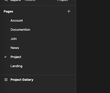
Additionally, you can sort your page alphabetically for faster navigating.
Team, Project, File
You're the only one in the team.

It's advisable to use a single team and one project for each app or website. For instance, if your app "Landmark" has an iOS client, a landing page, and a basic backend UI, you could organize them separately like this:
- Team - My Super Team
- Project - Landmark: Landing.figma, backend.figma, etc
- Project - ClipMemo: Icons.figma, Prototypes.figma, Shortlisting materials.figma, etc.
- Project - Social Content: Your build-in-public screenshot, poster, video cover, etc.
Instead of cramming all pages and components into one Figma file, consider separating them. Just as you wouldn't put all components and hooks into a single .tsx file in a React project, use Figma's scalable file functionality to create separate, autonomous files.
Use Figma's component and variable system for quick copy-and-pasting. Need an external design system (Tailwind, MD, etc)? Drag them from your Draft to one of the projects, then publish them.
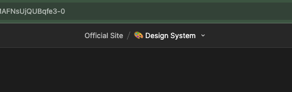
What’s more, as Figma displays a “Project/Filename” at the top of the editor, by doing these you can avoid naming a file too long such as “ClipMemo App”.
Components & Variables
Use components and variables across your team to streamline your design process. Components are reusable design elements, while variables allow you to define and manage design tokens.
Components
Components in Figma are powerful tools for maintaining consistency and efficiency:
- Create components for frequently used elements like buttons, icons, and form fields.
- Use instances of components across your designs for easy updates and maintenance.
- Utilize variants to create flexible components with different states or styles.
Variables
Variables in Figma help manage design tokens and create more dynamic designs:
- Define color, typography, and spacing variables for consistent branding.
- Use boolean variables to create interactive prototypes with conditional visibility.
- Leverage number variables for responsive designs that adapt to different screen sizes.
Using components and variables can significantly decrease your file size, improve consistency, and save time in your design process. BTW, they are shared across the whole project, but you need to add the library first if you need them in a file.
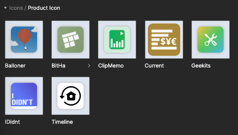
Therefore, it's practical to make a component for each logo/icon. Additionally, you can use color variables to ensure consistent branding across all your designs, making it easy to update your color scheme globally if needed.
Recap
- Keep frame count minimal in one page
- Keep files as small and nimble as possible
- Each product takes a project
- Prefer Figma’s component & variable system
- Create component for each product icon
Read More
- https://www.figma.com/best-practices/team-file-organization
- https://help.figma.com/hc/en-us/sections/4403935997847-Components
💡 Feel free to comment or drop me an email.